The need for spatial verification of weather extremes
We are all familiar with the impact of adverse weather conditions. Take for example winter storms, cloud bursts or the devastating effects of hurricanes or draughts. All meteorological centers have warning systems in place for such eventualities, and this is a well known fact to the general public, but in most occasions the public is not aware of the amount of work going behind all that to evaluate the quality of such warning systems. This is the task of forecast verification, an usually overlooked part of weather forecasting that aims to evaluate two main aspects of a weather forecast system: forecast calibration and forecast accuracy. Forecast calibration determines to what extent forecasts are trustworthy. It generally answers the question: do the observed outcomes occur with the same probability as they are predicted? Forecast accuracy is a measure of the agreement between a forecast and the corresponding observation. The difference between the forecast and the observation is the error. The lower the errors, the greater the accuracy.
The Hidden Problem: When "Good" Forecasts Look Bad
Most people are familiar with seeing weather models compared using metrics like Root Mean Square Error (RMSE) or correlation coefficients. These comparisons appear in scientific papers, operational reports, and model evaluation studies. However, these traditional point-based verification methods harbor a fundamental flaw that becomes particularly problematic when evaluating extreme weather forecasts. The evaluation of forecast calibration is usually done through sophisticated diagnostic and verification tools.
While I do not want to take a deep dive into the topic of forecast verification, I want to point out some well known issues in the way we verify weather forecasts, especially those from high-resolution numerical models. In general, when forecasting the weather with greater detail we should be able to find them useful because observed features are better reproduced. Right? However, the value of these forecasts is difficult to prove using traditional gridpoint-based verification statistics like RMSE or bias calculated point by point. The most critical forecasts - those produced by high resolution models for extreme weather events that can save lives - often receive the worst verification scores when evaluated using traditional methods.
Let's illustrate this problem with some dummy data using the python code below.
import numpy as np
import matplotlib.pyplot as plt
from matplotlib.patches import Rectangle
import matplotlib.patches as mpatches

# Create a blog-friendly visualization showing the RMSE problem with weather extremes
fig, axes = plt.subplots(2, 2, figsize=(14, 10))
fig.suptitle('Why Traditional Point Verification Can Mislead: The Case of Weather Extremes',
             fontsize=16, fontweight='bold', y=0.95)

# Create a realistic weather extreme scenario - a thunderstorm
grid_size = 20
x = np.linspace(0, 100, grid_size)  # 100 km domain
y = np.linspace(0, 100, grid_size)

# Observed thunderstorm (intense, localized)
observed = np.zeros((grid_size, grid_size))
# Create an intense thunderstorm at position (30km, 40km) -> grid (6, 8)
storm_center_obs = (6, 8)
for i in range(grid_size):
    for j in range(grid_size):
        distance = np.sqrt(((i - storm_center_obs[0]) * 5)**2 + ((j - storm_center_obs[1]) * 5)**2)
        if distance <= 15:  # 15 km radius
            observed[i, j] = 50 * np.exp(-distance/8)  # Intense precipitation up to 50 mm/h

# Forecast thunderstorm (same intensity, slightly displaced)
forecast = np.zeros((grid_size, grid_size))
# Storm predicted at (40km, 50km) -> grid (8, 10) - 10km displacement
storm_center_fcst = (8, 10)
for i in range(grid_size):
    for j in range(grid_size):
        distance = np.sqrt(((i - storm_center_fcst[0]) * 5)**2 + ((j - storm_center_fcst[1]) * 5)**2)
        if distance <= 15:  # Same size storm
            forecast[i, j] = 50 * np.exp(-distance/8)  # Same intensity

# Plot 1: Observed extreme event
im1 = axes[0,0].imshow(observed, cmap='Blues', vmin=0, vmax=50, origin='lower', extent=[0, 100, 0, 100])
axes[0,0].set_title('Observed: Severe Thunderstorm\n(Peak: 50 mm/h)', fontweight='bold', fontsize=12)
axes[0,0].set_xlabel('Distance (km)')
axes[0,0].set_ylabel('Distance (km)')
cbar1 = plt.colorbar(im1, ax=axes[0,0], shrink=0.8)
cbar1.set_label('Precipitation (mm/h)', fontsize=10)

# Add warning threshold line
axes[0,0].contour(observed, levels=[20], colors=['red'], linewidths=2, extent=[0, 100, 0, 100])
axes[0,0].text(10, 90, 'Warning Threshold\n(20 mm/h)', color='red', fontweight='bold',
               bbox=dict(boxstyle="round,pad=0.3", facecolor="white", alpha=0.8))

# Plot 2: Forecast extreme event
im2 = axes[0,1].imshow(forecast, cmap='Reds', vmin=0, vmax=50, origin='lower', extent=[0, 100, 0, 100])
axes[0,1].set_title('Forecast: Severe Thunderstorm\n(Peak: 50 mm/h, 10km displaced)', fontweight='bold', fontsize=12)
axes[0,1].set_xlabel('Distance (km)')
cbar2 = plt.colorbar(im2, ax=axes[0,1], shrink=0.8)
cbar2.set_label('Precipitation (mm/h)', fontsize=10)

# Add warning threshold and displacement arrow
axes[0,1].contour(forecast, levels=[20], colors=['red'], linewidths=2, extent=[0, 100, 0, 100])
axes[0,1].annotate('10 km displacement', xy=(40, 50), xytext=(30, 40),
                   arrowprops=dict(arrowstyle='->', lw=2, color='black'),
                   fontweight='bold', fontsize=10,
                   bbox=dict(boxstyle="round,pad=0.3", facecolor="yellow", alpha=0.8))

# Calculate RMSE and other traditional metrics
rmse = np.sqrt(np.mean((forecast - observed)**2))
mae = np.mean(np.abs(forecast - observed))
correlation = np.corrcoef(forecast.flatten(), observed.flatten())[0,1]

# Plot 3: Point-by-point errors
error_field = forecast - observed
im3 = axes[1,0].imshow(error_field, cmap='RdBu_r', vmin=-50, vmax=50, origin='lower', extent=[0, 100, 0, 100])
axes[1,0].set_title(f'Point-by-Point Errors\nRMSE: {rmse:.1f} mm/h', fontweight='bold', fontsize=12)
axes[1,0].set_xlabel('Distance (km)')
axes[1,0].set_ylabel('Distance (km)')
cbar3 = plt.colorbar(im3, ax=axes[1,0], shrink=0.8)
cbar3.set_label('Error (mm/h)', fontsize=10)

# Highlight the problem areas
axes[1,0].text(5, 85, 'Large negative errors\n(missed precipitation)',
               color='blue', fontweight='bold', fontsize=9,
               bbox=dict(boxstyle="round,pad=0.3", facecolor="white", alpha=0.8))
axes[1,0].text(60, 15, 'Large positive errors\n(false precipitation)',
               color='red', fontweight='bold', fontsize=9,
               bbox=dict(boxstyle="round,pad=0.3", facecolor="white", alpha=0.8))

# Plot 4: Traditional metrics summary
metrics = ['RMSE\n(mm/h)', 'MAE\n(mm/h)', 'Correlation']
values = [rmse, mae, correlation]
colors = ['red', 'orange', 'red']

bars = axes[1,1].bar(metrics, values, color=colors, alpha=0.7, edgecolor='black')
axes[1,1].set_title('Traditional Verification Metrics\n"Poor" Performance Despite Good Forecast',
                    fontweight='bold', fontsize=12)
axes[1,1].set_ylabel('Metric Value')

# Add value labels on bars
for i, (bar, value) in enumerate(zip(bars, values)):
    height = bar.get_height()
    if i < 2:  # RMSE and MAE
        axes[1,1].text(bar.get_x() + bar.get_width()/2., height + 0.5,
                      f'{value:.1f}', ha='center', va='bottom', fontweight='bold')
    else:  # Correlation
        axes[1,1].text(bar.get_x() + bar.get_width()/2., height + 0.02,
                      f'{value:.3f}', ha='center', va='bottom', fontweight='bold')

# Add interpretation text
axes[1,1].text(0.5, -0.15, 'High RMSE and MAE suggest "poor" forecast\nLow correlation suggests no skill\nBut the forecast correctly predicted the storm!',
               transform=axes[1,1].transAxes, ha='center', va='top', fontsize=10,
               bbox=dict(boxstyle="round,pad=0.5", facecolor="lightyellow", alpha=0.8))

plt.tight_layout()
plt.show()
This produces the image below.
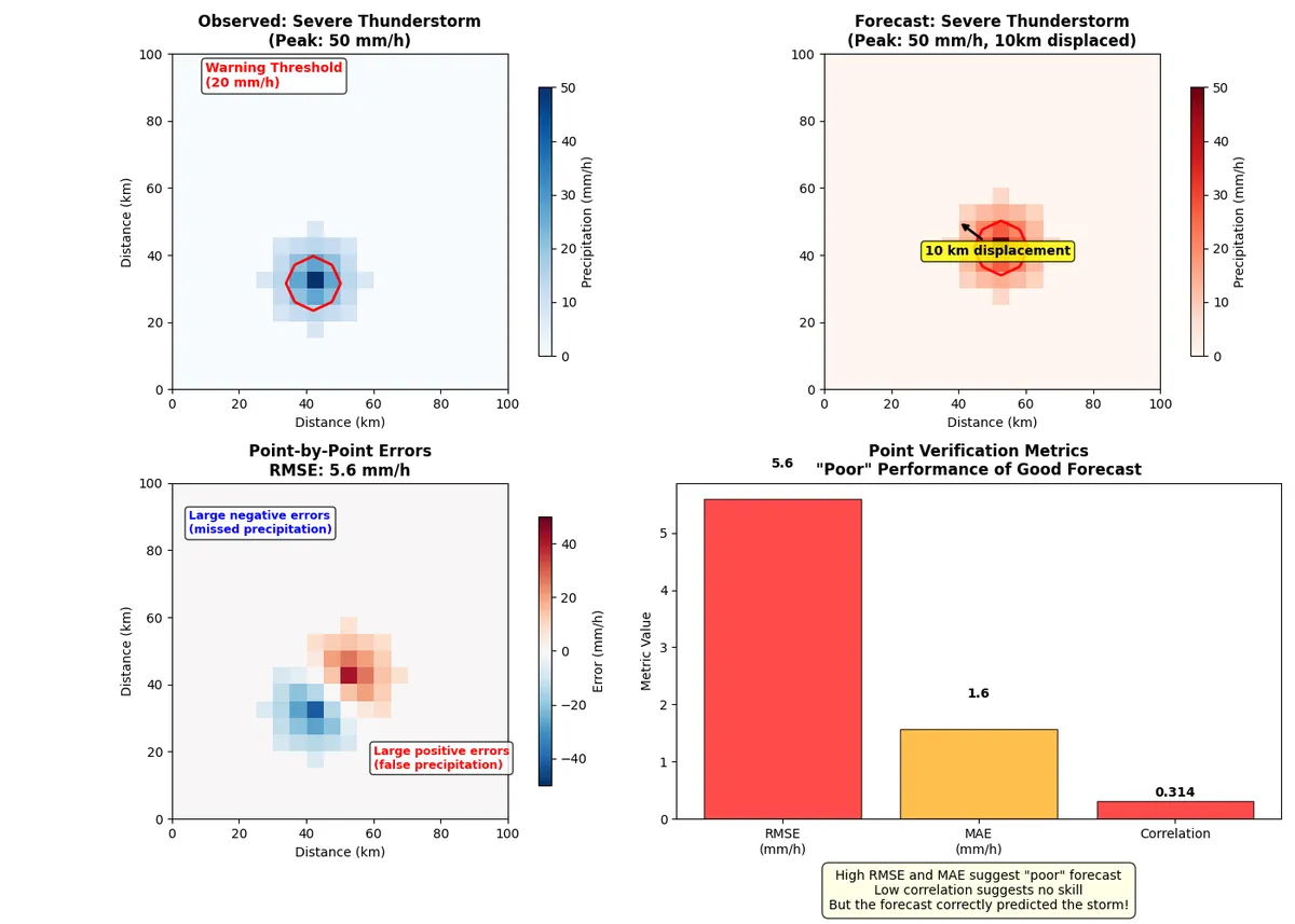
Traditional metrics suggest this is a 'poor' forecast, since the RMSE indicates large errors (5.6 mm/h). A Low correlation of 0.314 suggests no predictive skill.
However, the peak Observed Intensity of 50.0 mm/h and the peak Forecast Intensity: 50.0 mm/h was well forecasted. The problem is the spatial displacement in the forecast, which is ~10 km
The forecast correctly predicted:
- A severe thunderstorm would occur
- The correct intensity (50 mm/h)
- The correct size and structure
- The timing (same time)
The problem is only the location was off by 10 km (2 grid points). Because of this, the forecast is penalized twice. For most practical purposes, this is an excellent forecast! Warning systems could effectively use this information.
Verification paradox: why weather extremes might look 'poorly' forecast
Consider now another example below, this time illustrating one exampe of widesperead light rain, and one illustrating an extreme precipitation event.
import numpy as np
import matplotlib.pyplot as plt

# Create a figure showing the evolution of verification approaches
fig, axes = plt.subplots(2, 2, figsize=(14, 10))
fig.suptitle('Evolution of Weather Forecast Verification: From Points to Patterns',
             fontsize=16, fontweight='bold', y=0.95)

# Simulate different types of weather events and their verification challenges
grid_size = 15
x = np.linspace(0, 75, grid_size)  # 75 km domain

# Event 1: Widespread precipitation (easy to verify)
widespread_obs = np.random.normal(5, 1, (grid_size, grid_size))
widespread_obs[widespread_obs < 0] = 0
widespread_fcst = widespread_obs + np.random.normal(0, 0.5, (grid_size, grid_size))
widespread_fcst[widespread_fcst < 0] = 0

# Event 2: Localized extreme (hard to verify with traditional methods)
extreme_obs = np.zeros((grid_size, grid_size))
extreme_fcst = np.zeros((grid_size, grid_size))

# Add localized extreme event
center = (7, 7)
for i in range(grid_size):
    for j in range(grid_size):
        distance = np.sqrt((i - center[0])**2 + (j - center[1])**2)
        if distance <= 2:
            extreme_obs[i, j] = 25 * np.exp(-distance/1.5)

        # Forecast slightly displaced
        distance_fcst = np.sqrt((i - center[0] - 1)**2 + (j - center[1] - 1)**2)
        if distance_fcst <= 2:
            extreme_fcst[i, j] = 25 * np.exp(-distance_fcst/1.5)

# Plot 1: Widespread precipitation
im1 = axes[0,0].imshow(widespread_obs, cmap='Blues', vmin=0, vmax=8, origin='lower')
axes[0,0].set_title('Widespread Precipitation\n(Traditional Verification Works Well)', fontweight='bold')
axes[0,0].set_xlabel('Distance (km)')
axes[0,0].set_ylabel('Distance (km)')
plt.colorbar(im1, ax=axes[0,0], shrink=0.7, label='Precipitation (mm/h)')

# Calculate and display metrics for widespread
rmse_wide = np.sqrt(np.mean((widespread_fcst - widespread_obs)**2))
corr_wide = np.corrcoef(widespread_fcst.flatten(), widespread_obs.flatten())[0,1]
axes[0,0].text(0.02, 0.98, f'RMSE: {rmse_wide:.1f} mm/h\nCorr: {corr_wide:.3f}',
               transform=axes[0,0].transAxes, va='top', fontweight='bold',
               bbox=dict(boxstyle="round,pad=0.3", facecolor="white", alpha=0.8))

# Plot 2: Localized extreme - observed
im2 = axes[0,1].imshow(extreme_obs, cmap='Reds', vmin=0, vmax=25, origin='lower')
axes[0,1].set_title('Localized Extreme Event\n(Observed)', fontweight='bold')
axes[0,1].set_xlabel('Distance (km)')
plt.colorbar(im2, ax=axes[0,1], shrink=0.7, label='Precipitation (mm/h)')

# Plot 3: Localized extreme - forecast
im3 = axes[1,0].imshow(extreme_fcst, cmap='Reds', vmin=0, vmax=25, origin='lower')
axes[1,0].set_title('Localized Extreme Event\n(Forecast - Slightly Displaced)', fontweight='bold')
axes[1,0].set_xlabel('Distance (km)')
axes[1,0].set_ylabel('Distance (km)')
plt.colorbar(im3, ax=axes[1,0], shrink=0.7, label='Precipitation (mm/h)')

# Calculate metrics for extreme event
rmse_extreme = np.sqrt(np.mean((extreme_fcst - extreme_obs)**2))
corr_extreme = np.corrcoef(extreme_fcst.flatten(), extreme_obs.flatten())[0,1]
axes[1,0].text(0.02, 0.98, f'RMSE: {rmse_extreme:.1f} mm/h\nCorr: {corr_extreme:.3f}',
               transform=axes[1,0].transAxes, va='top', fontweight='bold',
               bbox=dict(boxstyle="round,pad=0.3", facecolor="white", alpha=0.8))

# Plot 4: Comparison of verification challenges
event_types = ['Widespread\nPrecipitation', 'Localized\nExtreme']
rmse_values = [rmse_wide, rmse_extreme]
corr_values = [corr_wide, corr_extreme]

x_pos = np.arange(len(event_types))
width = 0.35

bars1 = axes[1,1].bar(x_pos - width/2, rmse_values, width, label='RMSE (mm/h)',
                      color='lightcoral', alpha=0.8)
bars2 = axes[1,1].bar(x_pos + width/2, [c*10 for c in corr_values], width,
                      label='Correlation × 10', color='skyblue', alpha=0.8)

axes[1,1].set_xlabel('Event Type')
axes[1,1].set_ylabel('Metric Value')
axes[1,1].set_title('Traditional Verification:\nWhy Extremes Look "Worse"', fontweight='bold')
axes[1,1].set_xticks(x_pos)
axes[1,1].set_xticklabels(event_types)
axes[1,1].legend()

# Add value labels
for i, bar in enumerate(bars1):
    height = bar.get_height()
    axes[1,1].text(bar.get_x() + bar.get_width()/2., height + 0.1,
                  f'{height:.1f}', ha='center', va='bottom', fontweight='bold')

for i, bar in enumerate(bars2):
    height = bar.get_height()
    axes[1,1].text(bar.get_x() + bar.get_width()/2., height + 0.1,
                  f'{corr_values[i]:.2f}', ha='center', va='bottom', fontweight='bold')

plt.tight_layout()
plt.show()
The code above produces the image below.
In the first scenario, widespread light rain was predicted. This produces the scores
- RMSE: 0.5 mm/h
- Correlation: 0.886
- Interpretation: 'Good' forecast
In the second scenario localized Thunderstorm (life-threatening) is predicted and the following traditional scores say that:
- RMSE: 2.6 mm/h
- Correlation: 0.563
- Interpretation: 'Poor' forecast
Using the traditional interpretation this is a 'Poor' forecast. In reality, this is an excellent forecast, just 5km displaced!
The numbers tell a stark story. Widespread, gentle precipitation events - which pose little threat to public safety - received excellent verification scores. Meanwhile, localized extreme events - the very phenomena that weather warnings are designed to protect against - show poor traditional metrics despite being forecast with remarkable accuracy.
The solution: spatial verification using "fuzzy" logic
The solution lies in moving beyond traditional point-by-point verification to spatial verification methods. These approaches recognize that a forecast can be "nearly right" even with small displacement errors, and they quantify the spatial scales at which forecasts and observations agree.
I will discuss in a future post modern spatial verification techniques that provide a more nuanced and realistic assessment of forecast quality, especially for the extreme events that matter most for public safety. These techniques have been developed over the last couple of decades to better estimate forecast quality. Although these methods are not entirely new, they are usually unfamiliar to the general public, who are typically more familiar with standard point-based verification scores.
Some useful references on verification
- https://www.cawcr.gov.au/projects/verification/
- https://www.en.meteo.physik.uni-muenchen.de/forschung/atmo_dyn/scores/index.html#top
- https://www.ecmwf.int/en/about/media-centre/science-blog/2023/verifying-high-resolution-forecasts