When Every Region Is Hot at Once: Copenhagen in the Summer of 2026
A continental heatwave chart, zoomed down to one city with DANRA
It's been a brutal summer. Barely a week has gone by in 2026 without another heat warning, another wildfire evacuation, another all-time record somewhere in Western Europe. Heatwaves have been in the news a lot lately, and this year the coverage doesn't feel like a series of one-off events so much as a pattern that's settled in. A fifth wave is currently forecast for the next days.
Most disasters have an "outside." A flooded region has a dry region next door that can send pumps, ambulances, and spare capacity. A wildfire has unburned land around it. That outside is where the emergency response comes from. A continental heatwave doesn't have one: when the whole region is hot at once, hospitals, rail networks, power grids, and food systems are all under strain at the same time, and the reserve capacity that would normally come from an unaffected neighbour simply isn't there.
The chart below, built by Juan Jesus Gonzalez-Aleman from ERA5 data from the Copernicus Climate Data Store, is a good illustration of just how far this summer has pushed things:
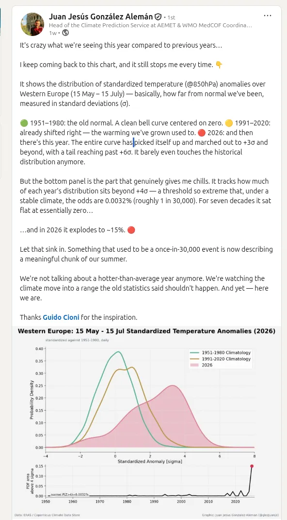
Two things happen at once in that figure. The 1991-2020 curve is already shifted right of the 1951-1980 baseline, but 2026 doesn't just shift, the whole distribution picks itself up and marches out past +3 sigma, with a tail reaching beyond +6. The bottom panel is the more telling one: the share of days sitting beyond 4 standard deviations from the historical climatology, a threshold that a stable climate would put at roughly 1 in 30,000 odds, sits flat near zero for seven decades and then jumps to about 15% in a single year. It isn't "warmer on average," it's "the far tail that used to be a rounding error is now describing a meaningful chunk of the summer."
That's a continental picture, across all of Western Europe. I wanted to see whether the same shape survives zooming all the way in, to one city, using a much higher-resolution dataset than a global reanalysis can offer.
Same idea, one city, 2.5 km instead of a continent
DANRA (Danish Regional Atmospheric Reanalysis) is DMI's 2.5 km, 3-hourly reanalysis over Denmark and its surroundings, published on public Zarr on AWS Open Data, no account or credentials needed. It runs September 1990 to October 2023, about 33 years, which is a fraction of ERA5's record but a lot more resolution at the one point I care about: Copenhagen (55.6761 N, 12.5683 E).
This is deliberately an empirical, descriptive route, not a formal
trend-detection study. One grid point, one variable (t2m, 2 m air
temperature), a linear fit through annual means, and the same
standardized-anomaly recipe as the reference chart above. No non-stationarity
testing, no significance correction, no attribution claim.
import os
import time

import matplotlib.pyplot as plt
import numpy as np
import pandas as pd
import xarray as xr
from scipy import stats
The whole DANRA single-levels store is about 10 TB across 31 variables.
Opening it with open_zarr only reads metadata, nothing downloads yet:
ds = xr.open_zarr(
    "s3://dmi-danra-05/single_levels.zarr",
    consolidated=True,
    storage_options={"anon": True},
)
ds["t2m"]
DANRA sits on a projected Lambert grid, so lat/lon are 2D auxiliary
coordinates rather than dimension coordinates. A brute-force nearest-neighbour
search on the 2D fields finds the grid cell closest to central Copenhagen:
LAT0, LON0 = 55.6761, 12.5683  # Copenhagen

dist2 = (ds["lat"] - LAT0) ** 2 + (ds["lon"] - LON0) ** 2
iy, ix = np.unravel_index(np.argmin(dist2.values), dist2.shape)

grid_lat = float(ds["lat"][iy, ix])
grid_lon = float(ds["lon"][iy, ix])
print(f"nearest grid cell: y={iy}, x={ix}  ->  {grid_lat:.3f} N, {grid_lon:.3f} E")
Pulling one grid cell's full 33-year record means downloading and decompressing roughly 380 of DANRA's 256-step time chunks, on the order of 5-10 minutes the first time. That daily-mean series is cached to CSV afterwards, so this post re-renders instantly:
CACHE_PATH = "data/danra_copenhagen_t2m_daily.csv"

if os.path.exists(CACHE_PATH):
    daily_df = pd.read_csv(CACHE_PATH, index_col=0, parse_dates=True)
    print(f"loaded cached daily series: {len(daily_df)} days")
else:
    print("no cache found, downloading from S3 (this can take several minutes)...")
    t0 = time.time()
    da_point = ds["t2m"].isel(y=iy, x=ix)
    da_point = da_point.load() - 273.15  # Kelvin -> Celsius
    da_point.attrs["units"] = "degC"
    print(f"download took {time.time() - t0:.0f}s")

    daily = da_point.resample(time="1D").mean()
    daily_df = daily.to_dataframe(name="t2m_degC")[["t2m_degC"]]
    daily_df.to_csv(CACHE_PATH)
    print(f"cached daily series to {CACHE_PATH}: {len(daily_df)} days")

daily_df.head()
The slow version: annual means, 1991-2022
Before anything about tails or standardized anomalies, the simplest possible check: a straight line through 32 annual means.
daily_df["year"] = daily_df.index.year

annual = daily_df.groupby("year")["t2m_degC"].mean()
annual = annual[(annual.index >= 1991) & (annual.index <= 2022)]  # full years only

years = annual.index.values.astype(float)
vals = annual.values
fit = stats.linregress(years, vals)

print(f"slope: {fit.slope:.4f} degC/year  ->  {fit.slope * 10:.2f} degC/decade")
print(f"r-squared: {fit.rvalue**2:.3f}")

fig, ax = plt.subplots(figsize=(8, 5))
ax.scatter(years, vals, color="#4c72b0", label="annual mean")
ax.plot(years, fit.intercept + fit.slope * years, color="#c44e52",
        label=f"OLS fit: {fit.slope * 10:.2f} degC/decade")
ax.set_xlabel("Year")
ax.set_ylabel("Annual mean 2 m temperature (degC)")
ax.set_title("Copenhagen annual mean temperature, 1991-2022 (DANRA)")
ax.legend()
fig.tight_layout()
fig.savefig("images/danra_copenhagen_trend.png", dpi=150)
plt.show()
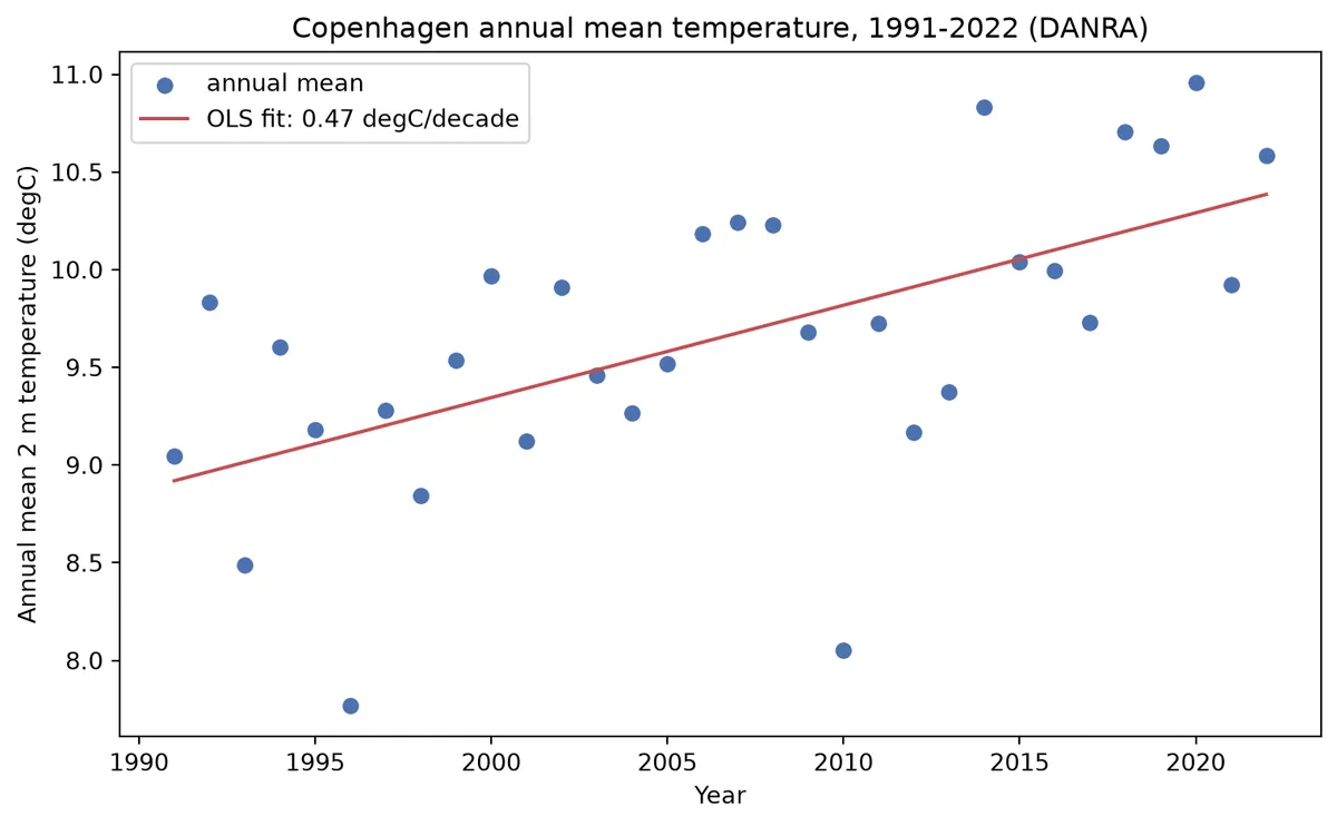
Roughly half a degree per decade, with the usual amount of year-to-year noise (2010 and 2021 sit well below the line, 2014 and 2020 well above it). Nothing dramatic on its own, this is exactly the kind of quiet drift that's easy to wave off in any single year and easy to miss entirely if you only ever look at one summer at a time.
Splitting the 33-year record into three roughly equal periods and pooling all seasons shows the same drift as a distribution shift rather than a single number. 1990 and 2023 are partial calendar years and are left out of this comparison so each group is a fair full-year sample:
def period_label(year):
    if 1991 <= year <= 2001:
        return "1991-2001"
    if 2002 <= year <= 2012:
        return "2002-2012"
    if 2013 <= year <= 2022:
        return "2013-2022"
    return None


daily_df["period"] = daily_df["year"].apply(period_label)

fig, ax = plt.subplots(figsize=(8, 5))
bins = np.arange(-15, 30, 1.0)
colors = {"1991-2001": "#4c72b0", "2002-2012": "#dd8452", "2013-2022": "#c44e52"}

for label, sub in daily_df.dropna(subset=["period"]).groupby("period"):
    counts, edges = np.histogram(sub["t2m_degC"], bins=bins, density=True)
    ax.bar(
        edges[:-1], counts, width=np.diff(edges), align="edge",
        alpha=0.45, color=colors[label], label=f"{label} (n={len(sub)})",
    )

ax.set_xlabel("Daily mean 2 m temperature (degC)")
ax.set_ylabel("Density")
ax.set_title("Copenhagen daily mean temperature, by period (DANRA)")
ax.legend()
fig.tight_layout()
fig.savefig("images/danra_copenhagen_distributions.png", dpi=150)
plt.show()
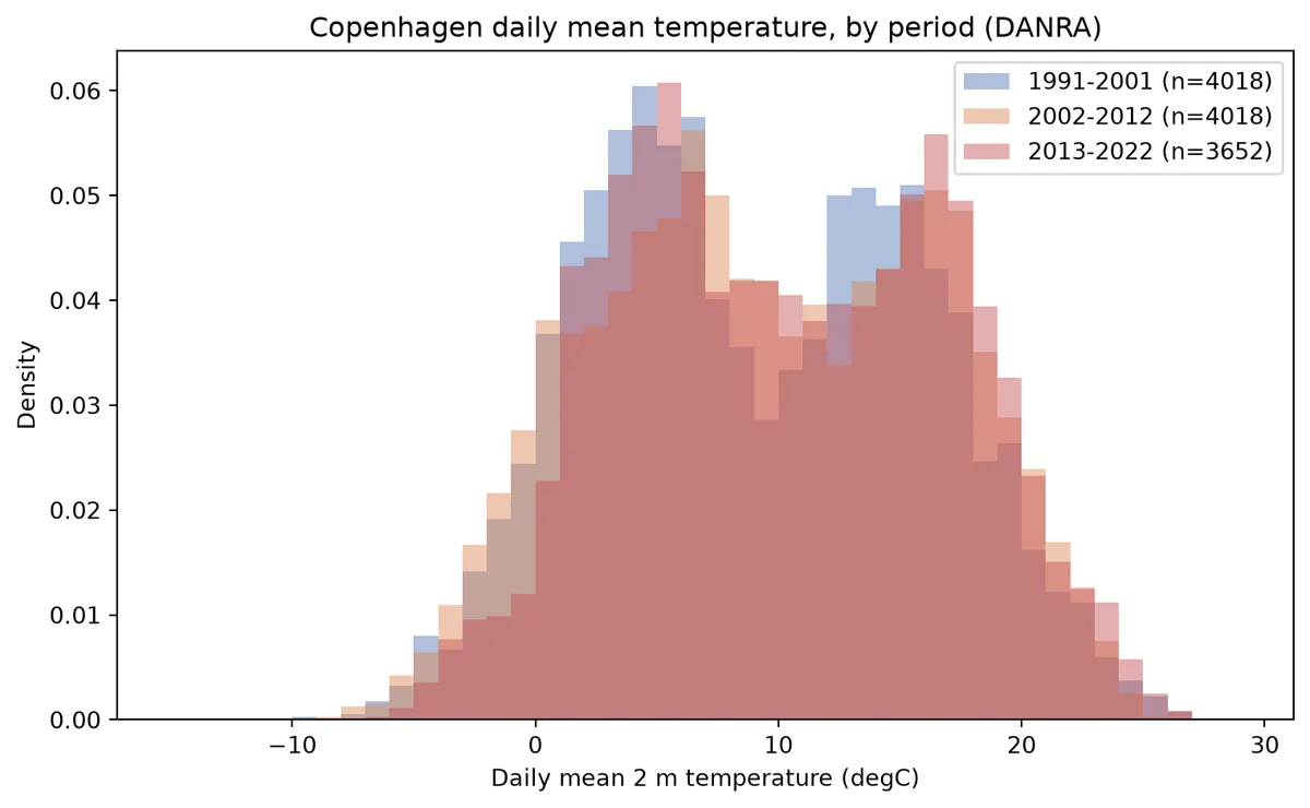
Pooling all seasons makes the distribution naturally wide and a bit bimodal, winter and summer sit far apart. What matters isn't a clean separation, it's the small rightward shift in the bulk of the distribution from the earliest decade to the most recent one.
Reproducing the reference chart, at Copenhagen scale
This is the part that maps most directly onto Gonzalez-Aleman's chart above. Window: 15 May - 15 Jul, the early-summer stretch most relevant to heatwave risk. Every day in that window gets standardized against a day-of-year climatology (mean and standard deviation pooled across +/-7 days, to smooth out day-to-day sampling noise) built from 1991-2001, the earliest full decade DANRA offers, there's no 1951-1980-equivalent baseline available since the record only starts in 1990.
synth = pd.to_datetime("2001-" + daily_df.index.strftime("%m-%d"), errors="coerce")
daily_df["synth"] = synth
WIN_START, WIN_END = pd.Timestamp("2001-05-15"), pd.Timestamp("2001-07-15")
BUF_START, BUF_END = pd.Timestamp("2001-05-08"), pd.Timestamp("2001-07-22")  # window +/- 7 days

window_mask = daily_df["synth"].between(WIN_START, WIN_END)
buffer_mask = daily_df["synth"].between(BUF_START, BUF_END)

BASE_START, BASE_END = 1991, 2001      # standardization baseline
RECENT_START, RECENT_END = 2013, 2022  # most recent full decade
CURRENT_YEAR = int(daily_df["year"].max())  # 2023 (partial year overall, window itself complete)

base_buffer = daily_df[buffer_mask & daily_df["year"].between(BASE_START, BASE_END)]
target_days = sorted(daily_df.loc[window_mask, "synth"].unique())

bd = base_buffer["synth"].values.astype("datetime64[D]")
bv = base_buffer["t2m_degC"].values
clim_mean, clim_std = {}, {}
for t in target_days:
    dist = np.abs((bd - np.datetime64(t, "D")).astype(int))
    sel = bv[dist <= 7]
    clim_mean[t] = sel.mean()
    clim_std[t] = sel.std(ddof=1)

daily_df["clim_mean"] = daily_df["synth"].map(clim_mean)
daily_df["clim_std"] = daily_df["synth"].map(clim_std)
daily_df["z"] = (daily_df["t2m_degC"] - daily_df["clim_mean"]) / daily_df["clim_std"]

win = daily_df[window_mask].dropna(subset=["z"]).copy()

z_base = win.loc[win["year"].between(BASE_START, BASE_END), "z"].values
z_recent = win.loc[win["year"].between(RECENT_START, RECENT_END), "z"].values
z_current = win.loc[win["year"] == CURRENT_YEAR, "z"].values

print(f"n days -> base {len(z_base)}, recent {len(z_recent)}, current {len(z_current)}")
print(f"mean z -> base {z_base.mean():.2f}, recent {z_recent.mean():.2f}, "
      f"current {z_current.mean():.2f}")
The bottom panel asks the same narrow question the reference chart asks: in a given year's window, what fraction of the fitted distribution sits beyond 4 sigma, against the near-zero share a normal distribution would predict there. Each year's window is only 62 days, so this is a noisy per-year estimate, not a robust tail statistic, but the pattern of occasional spikes standing well above the normal-reference line is the same kind of signal the original chart was built to show.
years_list = sorted(win["year"].unique())
tail_years, tail_area = [], []
for y in years_list:
    zy = win.loc[win["year"] == y, "z"].values
    if len(zy) < 20:
        continue
    kde_y = stats.gaussian_kde(zy)
    tail_years.append(y)
    tail_area.append(kde_y.integrate_box_1d(4, 30))
tail_years = np.array(tail_years)
tail_area = np.array(tail_area)
normal_p4 = 1 - stats.norm.cdf(4)  # one-sided normal reference, ~0.0032%

COLOR_BASE, COLOR_RECENT, COLOR_CURRENT = "#4c72b0", "#dd8452", "#c44e52"

fig, (ax_top, ax_bot) = plt.subplots(
    2, 1, figsize=(8, 7), gridspec_kw={"height_ratios": [3, 1]}
)

grid = np.linspace(-4, 9, 400)
kde_base = stats.gaussian_kde(z_base)(grid)
kde_recent = stats.gaussian_kde(z_recent)(grid)
kde_current = stats.gaussian_kde(z_current)(grid)

ax_top.plot(grid, kde_base, color=COLOR_BASE, linewidth=1.8,
            label=f"{BASE_START}-{BASE_END} Climatology")
ax_top.plot(grid, kde_recent, color=COLOR_RECENT, linewidth=1.8,
            label=f"{RECENT_START}-{RECENT_END} Climatology")
ax_top.fill_between(grid, kde_current, color=COLOR_CURRENT, alpha=0.35, linewidth=0)
ax_top.plot(grid, kde_current, color=COLOR_CURRENT, linewidth=1.6, label=f"{CURRENT_YEAR}")

ax_top.set_xlim(-4, 9)
ax_top.set_ylim(bottom=0)
ax_top.set_xlabel("Standardized Anomaly [sigma]")
ax_top.set_ylabel("Probability Density")
ax_top.legend(frameon=True, fontsize=9)
ax_top.grid(alpha=0.25, linewidth=0.6)

fig.suptitle(
    f"Copenhagen: 15 May - 15 Jul Standardized Temperature Anomalies ({CURRENT_YEAR})",
    fontsize=12.5, fontweight="bold", x=0.01, y=0.975, ha="left",
)
fig.text(
    0.01, 0.938, f"standardized against {BASE_START}-{BASE_END} day-of-year climatology "
    "(+/-7 day smoothing), daily", fontsize=8.5, color="0.35",
)

ax_bot.plot(tail_years, tail_area, color="0.25", linewidth=1.2, marker="o", markersize=3)
cur_idx = np.where(tail_years == CURRENT_YEAR)[0]
if len(cur_idx):
    ax_bot.plot(tail_years[cur_idx], tail_area[cur_idx], "o", color=COLOR_CURRENT,
                markersize=6, zorder=5)
ax_bot.axhline(normal_p4, color="0.5", linewidth=0.8, linestyle=":",
               label=f"normal P(Z>4)={normal_p4 * 100:.4f}%")
ax_bot.set_xlabel("Year")
ax_bot.set_ylabel("PDF area above 4σ", fontsize=8.5)
ax_bot.legend(fontsize=7.5, loc="upper left")
ax_bot.grid(alpha=0.25, linewidth=0.6)

fig.text(0.01, 0.005, "Data: DANRA (DMI) / AWS Open Data", fontsize=7.5, color="0.4")
fig.text(0.99, 0.005, "Graphic: Carlos Peralta", fontsize=7.5, color="0.4", ha="right")

fig.subplots_adjust(top=0.90, bottom=0.08, left=0.11, right=0.97, hspace=0.32)
fig.savefig("images/danra_copenhagen_anomaly_ridge.png", dpi=150)
plt.show()
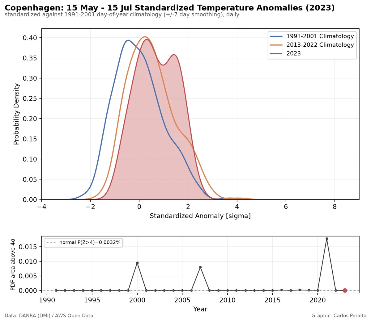
The 1991-2001 curve sits centered near 0 by construction (it's standardized against itself). 2013-2022 is shifted right of it, and 2023 further still, the same early-summer warming already visible in the annual-mean trend, now re-expressed in the exact sigma units the reference chart uses. The bottom panel's spikes, 2000, 2007, and 2021 stand out, are single very hot days pushing that year's window briefly into the far tail, not a monotonic climb. 62 days is too small a sample for a clean trend in a rare-tail statistic; read each spike as "this particular year had an outlier hot day relative to the 1990s baseline," not as a calibrated hazard-rate estimate.
This isn't a like-for-like comparison with the reference chart. That figure is built from 70+ years of ERA5 against a 1951-1980 baseline, both a longer standardization baseline and a longer tail-statistic series than the 33-year DANRA record can offer, and it's averaged across the whole of Western Europe rather than one grid cell. The absolute numbers, how far right the curves sit, how high the tail spikes go, aren't comparable across the two. Only the shape of the story is: later periods shift right, occasional years spike well past a normal-reference line, and that shape survives shrinking the spatial scale by several orders of magnitude and swapping a continent for a city block.
Is this an unusual amount of warming, or an ordinary one?
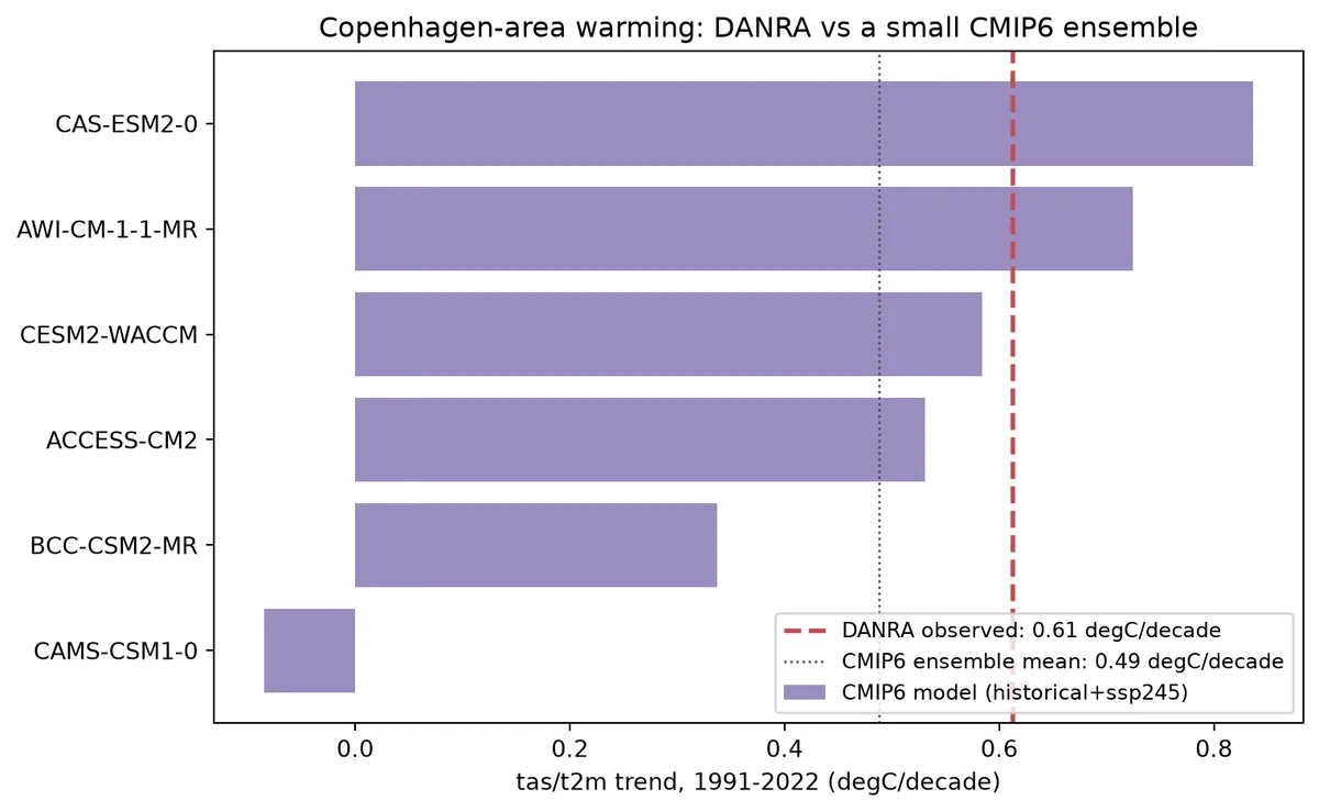
Everything above is a single realization at a single point, DANRA's best estimate of what actually happened at this one grid cell. On its own, it can't say whether the observed trend is a remarkable amount of warming or an unremarkable one. CMIP6 global climate models offer a rough benchmark: each is a physically-based simulation of the forced warming response plus its own internal variability, so running the same baseline-anomaly-and-OLS-trend recipe on a handful of them gives a spread to compare DANRA's single trend against.
This comparison is coarser than everything above for two reasons that matter: CMIP6 models run at roughly 100-250 km grid spacing, so the nearest model cell to Copenhagen represents a large chunk of southern Scandinavia and the western Baltic, not the city; and a CMIP6 historical run is free-running, not nudged to reproduce the actual sequence of weather that occurred, so only the long-term trend and the ensemble spread around it are meaningful, not any single year's value against DANRA's.
CMIP6_CACHE_PATH = "data/cmip6_copenhagen_tas_monthly.csv"
cmip6_df = pd.read_csv(CMIP6_CACHE_PATH, parse_dates=["date"])
print(f"cached CMIP6 series: {len(cmip6_df)} rows, {cmip6_df['model'].nunique()} models")

CMIP6_BASELINE_START, CMIP6_BASELINE_END = 1991, 2020


def trend_degC_per_decade(df_m):
    s = df_m.set_index("date")["tas_degC"].resample("MS").mean()
    baseline = s[(s.index.year >= CMIP6_BASELINE_START) & (s.index.year <= CMIP6_BASELINE_END)].mean()
    anom = s - baseline
    t = anom.index.year + (anom.index.month - 1) / 12
    f = stats.linregress(t, anom.values)
    return f.slope * 10


model_trends = (
    cmip6_df.groupby("model")
    .apply(trend_degC_per_decade, include_groups=False)
    .rename("trend_degC_per_decade")
    .sort_values()
)

monthly = daily_df["t2m_degC"].resample("MS").mean()
baseline_mask = (monthly.index.year >= CMIP6_BASELINE_START) & (monthly.index.year <= CMIP6_BASELINE_END)
anomaly = monthly - monthly[baseline_mask].mean()
t_years = anomaly.index.year + (anomaly.index.month - 1) / 12
fit_anom = stats.linregress(t_years, anomaly.values)
danra_trend_decade = fit_anom.slope * 10

fig, ax = plt.subplots(figsize=(8, 5))
ax.barh(model_trends.index, model_trends.values, color="#8172b2", alpha=0.8,
        label="CMIP6 model (historical+ssp245)")
ax.axvline(danra_trend_decade, color="#c44e52", linewidth=2, linestyle="--",
           label=f"DANRA observed: {danra_trend_decade:.2f} degC/decade")
ax.axvline(model_trends.mean(), color="0.3", linewidth=1, linestyle=":",
           label=f"CMIP6 ensemble mean: {model_trends.mean():.2f} degC/decade")
ax.set_xlabel(f"tas/t2m trend, {CMIP6_BASELINE_START}-2022 (degC/decade)")
ax.set_title("Copenhagen-area warming: DANRA vs a small CMIP6 ensemble")
ax.legend(loc="lower right", fontsize=9)
fig.tight_layout()
fig.savefig("images/danra_vs_cmip6_trend.png", dpi=150)
plt.show()
What this does and doesn't show
- One grid point, one location. Copenhagen only, no claim about Denmark or anywhere else DANRA covers.
- A straight line through 32 annual means is a description, not a detection. No autocorrelation test, no change-point analysis.
- This is the empirical route, not extreme value statistics. Annual means, not annual maxima or a GEV/GPD tail fit. It shows the distribution shifting, not how the far tail, the events that actually drive risk, is behaving.
- No bias correction, no comparison against station observations, no second reanalysis at the same point.
- The 1991-2020 baseline (and the 1991-2001 standardization baseline for the anomaly chart) are conventions, not discoveries, chosen for comparability with published anomaly series, not because they're uniquely correct.
Back to "no outside"
None of this is dramatic on its own. Half a degree per decade, a slightly right-shifted distribution, a handful of years with an outlier hot day. That's precisely the point Gonzalez-Aleman's chart is making at a larger scale, and the reason the "no outside" framing matters: the risk isn't one big obvious jump, it's a slow, easy-to-dismiss drift that quietly narrows the margin everywhere at once. A flood's outside can lend you pumps and generators because it isn't also flooded. When the underlying distribution has shifted continent-wide, there's less slack left for any region to lend its neighbours, right when a hot summer needs it most. One city's reanalysis record can't tell you how bad that gets. It can tell you the same quiet rightward shift is visible all the way down to a single grid cell, and that's worth taking seriously before the tail spikes stop looking like outliers.
If you want to repeat the analysis, the quarto notebook from which this post was generated can be found here.