Communicating extreme weather events
In recent days, there has been a significant amount of media coverage regarding Hurricane Kirk and its unusual path pointing towards Europe.
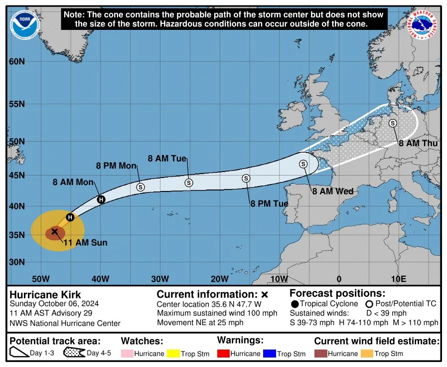
Most pictures in social media point to the classical "NOAA cone of uncertainty" that shows the probable track of the center of a tropical cyclone over the Atlantic.This quite a complicated picture to interpret. According to the official definition:
The cone represents the probable track of the center of a tropical cyclone, and is formed by enclosing the area swept out by a set of circles (not shown) along the forecast track (at 12, 24, 36 hours, etc). The size of each circle is set so that two-thirds of historical official forecast errors over a 5-year sample fall within the circle. The circle radii defining the cones in 2024 for the Atlantic, Eastern North Pacific, and Central North Pacific basins are given in the table below.That is a handful of information for one plot. It's been pointed out by experts in data visualization, like Alberto Cairo, that this type of graphic is overloaded with multiple types of information in addition to forecast uncertainty, with the amount of information presented and the graphic features employed contributing to visual clutter and information overload (see for example Millet et al, 2022).
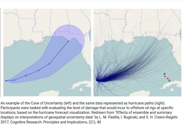
For example, someone who sees this kind of picture might be misled to feel safer in locations just outside the cone limits. Lace Padilla suggested modifications to this plot, for example the simplified version below.
These studies highlight a very common trend in science communication: technical plots, while informative, can be challenging for non-experts to understand, which can hinder effective communication, in this case of critical weather information.
This is by no means an isolated issue. I have been reading a recent book on the topic of weather warnings, and chapter 3 has a broad discusison on the challenges of achieving an adequate level of awareness of disaster risk, by each person or organisation receiving a warning. Not saying here that the cone of uncertainty is a useless plot for most people, just saying that, given the increased occurrence of extreme weather one would also expect an increased availabilty of clearer and more inclusive weather warnings. Data visualizations of such extreme weather events should be more clear in presenting coverage areas and phenomena, and communicating spatial variations in severity without overly technical language in the message text. Overloading your brain with information in times of distress is not particularly helpful.